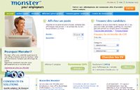
With the new version of its site, simultaneously launched in 24 countries, Monster is seeking to conquer Web 2.0 and follow in the footsteps of social networking sites. Its in-depth redesign required 18 months of development work. The clean design, information sharing and personalization features represent a major facelift for the venerable job site.
- Simplicity and speed
 Gone are the coloured monster and purple spiral—the Monster logo is now reduced to simply its name and the slogan “Your calling is calling.” The same simplification applies to the home page, which has been streamlined to highlight the search engine.
It is now faster for candidates to apply. All you need is your e-mail address, password and resume, and the upload is a lot faster. The new job presentation is also designed to be faster, because you can now browse the content of jobs without having to click on them. Little pictograms indicate whether the ad contains a map showing where the job is, if the salary is specified, if a presentation video is available, etc.
For recruiters, the home page presentation is more user friendly, and the “Post & Manage Jobs” and “Find & Manage candidates” tabs allow quicker access to current tasks.
- Sharing and interactivity
The success of social networks such as Facebook and LinkedIn has clearly inspired Monster. For candidates, the “Monster Career Snapshots” database provides access to thousands of occupational profiles describing various roles, the skills required, and the compensation and working conditions associated with them, such as work/life balance for example. Users will be able to enrich its content by incorporating their own comments. Similarly, the “Monster Career Benchmarking” tool will help job seekers measure themselves against other candidates with a similar profile.
Nice tools, which are for now just available in the U.S.—the site plans to roll them out worldwide in the coming months. The patent-pending “Monster Career Mapping” tool will allow job seekers to view the various career paths taken by other people with similar profiles.
- Personalization
 Personalization is hot right now and Monster has jumped on the bandwagon. Job seekers can now modify the layout of their home page or change the various headings known as widgets and which include profile resume, recommended jobs, summary of career goals, recent activity and saved jobs. The right-hand column remains devoted to featured employers. The focus is also put on content, with quick tips offered throughout the browsing experience.
For recruiters, a hiring solutions tool has users fill out a quick questionnaire and then generates various posting proposals based on their answers. Inspired by the success of GoogleAds, Monster has also announced better targeting of job seekers via advertising during their entire visit on the site.
——————
A BBDO campaign
To accompany the relaunch of its site, Monster is launching a global advertising campaign in Canada, the U.S. and Europe. Created by BBDO, it will feature television, media, online and event components. The campaign showcases passionate people clearly in the wrong job, such as a man afraid of heights in a high-rise construction job, or a keyboardist launching into an electronic solo right in the middle of a classical concert. The slogan is a call to action: “There’s never been a better time to go to Monster.com.”